Not Found
When a user sees a 404 page, it means something has gone wrong. Just like empty states, 404 pages should be clear and helpful, with as little jargon as possible. Where possible, provide the user with some key next steps they can take to get back on track.
Simple 01
404 error
We can’t find that page
Sorry, the page you are looking for doesn't exist or has been moved.
<template> <div class="min-h-screen flex flex-col md:justify-center mx-auto px-4 py-16 md:px-20 md:py-24 bg-white"> <div class="md:p-8"> <p class="text-base font-semibold text-primary-700 mb-3">404 error</p> <h1 class="text-gray-900 text-display-md md:text-display-xl leading-tight font-semibold"> We can’t find that page </h1> <p class="mt-3 md:mt-6 text-gray-600 text-lg md:text-xl"> Sorry, the page you are looking for doesn't exist or has been moved. </p> <div class="flex md:hidden flex-col-reverse gap-3 mt-8"> <VBtn size="md" prefix-icon="ri:arrow-left-line">Go back</VBtn> <VBtn size="md" color="primary">Take me home</VBtn> </div> <div class="hidden md:flex flex-row gap-3 mt-12"> <VBtn size="lg" prefix-icon="ri:arrow-left-line">Go back</VBtn> <VBtn size="lg" color="primary">Take me home</VBtn> </div> </div> </div></template>Simple 02
404 error
Page not found
Sorry, the page you are looking for doesn't exist.
Dive in to learn all about our product.
Read the latest posts on our blog.
Our friendly team is here to help.
<template> <div class="min-h-screen px-4 py-16 md:px-20 md:py-24 bg-white"> <div class="flex flex-col md:justify-center md:px-8"> <p class="text-base font-semibold text-primary-700 mb-3">404 error</p> <h1 class="text-gray-900 text-display-md md:text-display-xl leading-tight font-semibold"> Page not found </h1> <p class="mt-3 md:mt-6 text-gray-600 text-lg md:text-xl"> Sorry, the page you are looking for doesn't exist. </p> <div class="flex md:hidden flex-col-reverse gap-3 mt-8"> <VBtn size="md" prefix-icon="ri:arrow-left-line">Go back</VBtn> <VBtn size="md" color="primary">Take me home</VBtn> </div> <div class="hidden md:flex flex-row gap-3 mt-12"> <VBtn size="lg" prefix-icon="ri:arrow-left-line">Go back</VBtn> <VBtn size="lg" color="primary">Take me home</VBtn> </div> <div class="mt-8 md:mt-12"> <VList class="!p-0"> <VListItem hidePrepend hideAppend class="!p-0"> <VBtn color="primary" suffixIcon="ri:arrow-right-line" suffixIconSize="20" size="sm" flush text noRing > <p class="text-base">Documentation</p> </VBtn> <p class="text-gray-600 mt-1">Dive in to learn all about our product.</p> </VListItem> <VListItem hidePrepend hideAppend class="!p-0 mt-6"> <VBtn color="primary" suffixIcon="ri:arrow-right-line" suffixIconSize="20" size="sm" flush text noRing > <p class="text-base">Our Blog</p> </VBtn> <p class="text-gray-600 mt-1">Read the latest posts on our blog.</p> </VListItem> <VListItem hidePrepend hideAppend class="!p-0 mt-6"> <VBtn color="primary" suffixIcon="ri:arrow-right-line" suffixIconSize="20" size="sm" flush text noRing > <p class="text-base">Chat to support</p> </VBtn> <p class="text-gray-600 mt-1">Our friendly team is here to help.</p> </VListItem> </VList> </div> </div> </div></template>Simple 03
Page not found
The page you are looking for doesn't exist. Here are some helpful links:
<template> <div class="min-h-screen flex flex-col items-center justify-center mx-auto px-4 py-16 md:px-20 md:py-24 bg-white"> <div class="w-12 h-12 md:w-[56px] md:h-[56px] flex justify-center items-center bg-primary-100 border-8 md:border- border-primary-50 rounded-full mb-6"> <VIcon name="tabler:alert-circle" class="text-primary-600" /> </div> <h1 class="text-gray-900 text-center text-display-md md:text-display-xl leading-tight font-semibold"> Page not found </h1> <p class="mt-4 md:mt-6 text-gray-600 text-lg md:text-xl text-center md:whitespace-pre-wrap"> The page you are looking for doesn't exist.{{ '\n' }}Here are some helpful links: </p> <div class="flex w-full md:hidden flex-col-reverse gap-3 mt-8 md:mt-12"> <VBtn size="md" prefix-icon="ri:arrow-left-line">Go back</VBtn> <VBtn size="md" color="primary">Take me home</VBtn> </div> <div class="hidden md:flex flex-row gap-3 mt-12"> <VBtn size="lg" prefix-icon="ri:arrow-left-line">Go back</VBtn> <VBtn size="lg" color="primary">Take me home</VBtn> </div> </div></template>Simple 04
404 error
We lost this page
We searched high and low, but couldn’t find what you’re looking for. Let’s find a better place for you to go.
Documentation
Dive in to learn all about our product.
Our Blog
Read the latest posts on our blog.
Chat to us
Can’t find what you’re looking for?
<template> <div class="min-h-screen flex flex-col items-center justify-center mx-auto px-4 py-16 md:px-20 md:py-24 bg-white"> <div class="md:px-8 flex flex-col items-center justify-center w-full"> <p class="text-primary-700 font-semibold mb-3 text-center">404 error</p> <h1 class="text-gray-900 text-center text-display-md md:text-display-xl leading-tight font-semibold"> We lost this page </h1> <p class="mt-4 md:mt-6 text-gray-600 text-lg md:text-xl text-center md:whitespace-pre-wrap"> We searched high and low, but couldn’t find what you’re looking for.{{ '\n' }}Let’s find a better place for you to go. </p> <div class="flex flex-1 w-full md:hidden flex-col-reverse gap-3 mt-8 md:mt-12"> <VBtn size="md" prefix-icon="ri:arrow-left-line">Go back</VBtn> <VBtn size="md" color="primary">Take me home</VBtn> </div> <div class="hidden md:flex flex-row gap-3 mt-12"> <VBtn size="lg" prefix-icon="ri:arrow-left-line">Go back</VBtn> <VBtn size="lg" color="primary">Take me home</VBtn> </div> <div class="mt-16 md:mt-24 flex flex-col w-full md:grid md:grid-cols-3 gap-y-4 md:gap-x-8"> <div class="flex flex-col items-start bg-gray-50 p-5 md:p-6"> <VIcon name="heroicons:code-bracket-square" class="text-primary-600 mb-8 md:mb-12" /> <p class="text-gray-900 text-xl font-semibold">Documentation</p> <p class="text-gray-600 mt-1 md:mt-2 mb-4 md:mb-5">Dive in to learn all about our product.</p> <VBtn color="primary" suffixIcon="ri:arrow-right-line" suffixIconSize="20" size="sm" flush text noRing > <p class="text-base">Start learning</p> </VBtn> </div> <div class="flex flex-col items-start bg-gray-50 p-5 md:p-6"> <VIcon name="ri:book-open-line" class="text-primary-600 mb-8 md:mb-12" /> <p class="text-gray-900 text-xl font-semibold">Our Blog</p> <p class="text-gray-600 mt-1 md:mt-2 mb-4 md:mb-5">Read the latest posts on our blog.</p> <VBtn color="primary" suffixIcon="ri:arrow-right-line" suffixIconSize="20" size="sm" flush text noRing > <p class="text-base">View lastest posts</p> </VBtn> </div> <div class="flex flex-col items-start bg-gray-50 p-5 md:p-6"> <VIcon name="jam:messages-alt" class="text-primary-600 mb-8 md:mb-12" /> <p class="text-gray-900 text-xl font-semibold">Chat to us</p> <p class="text-gray-600 mt-1 md:mt-2 mb-4 md:mb-5">Can’t find what you’re looking for?</p> <VBtn color="primary" suffixIcon="ri:arrow-right-line" suffixIconSize="20" size="sm" flush text noRing > <p class="text-base">Chat to our team</p> </VBtn> </div> </div> </div> </div></template>Split Image 01
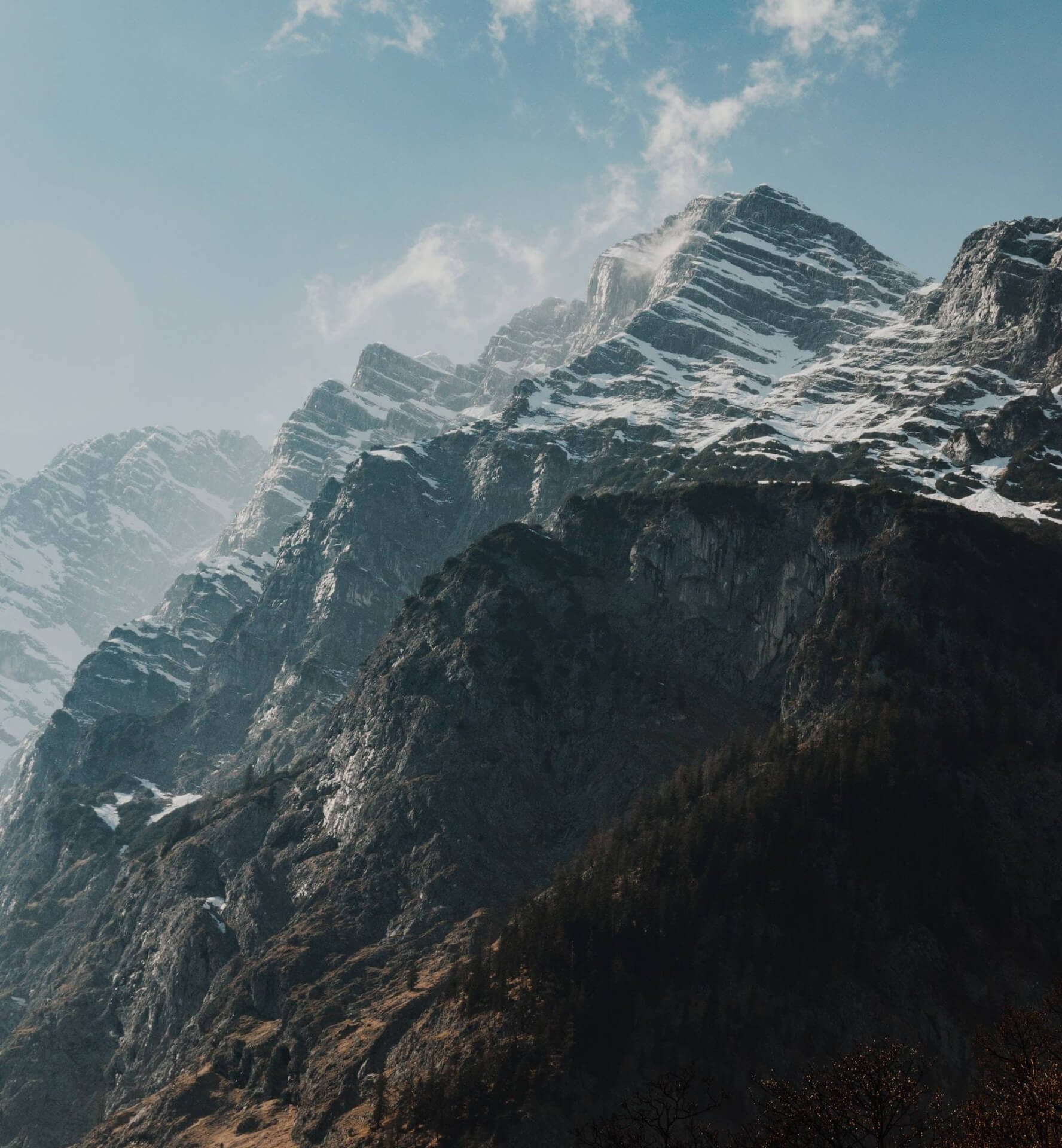
Page not found
Sorry, the page you are looking for doesn't exist or has been moved. Here are some helpful links:
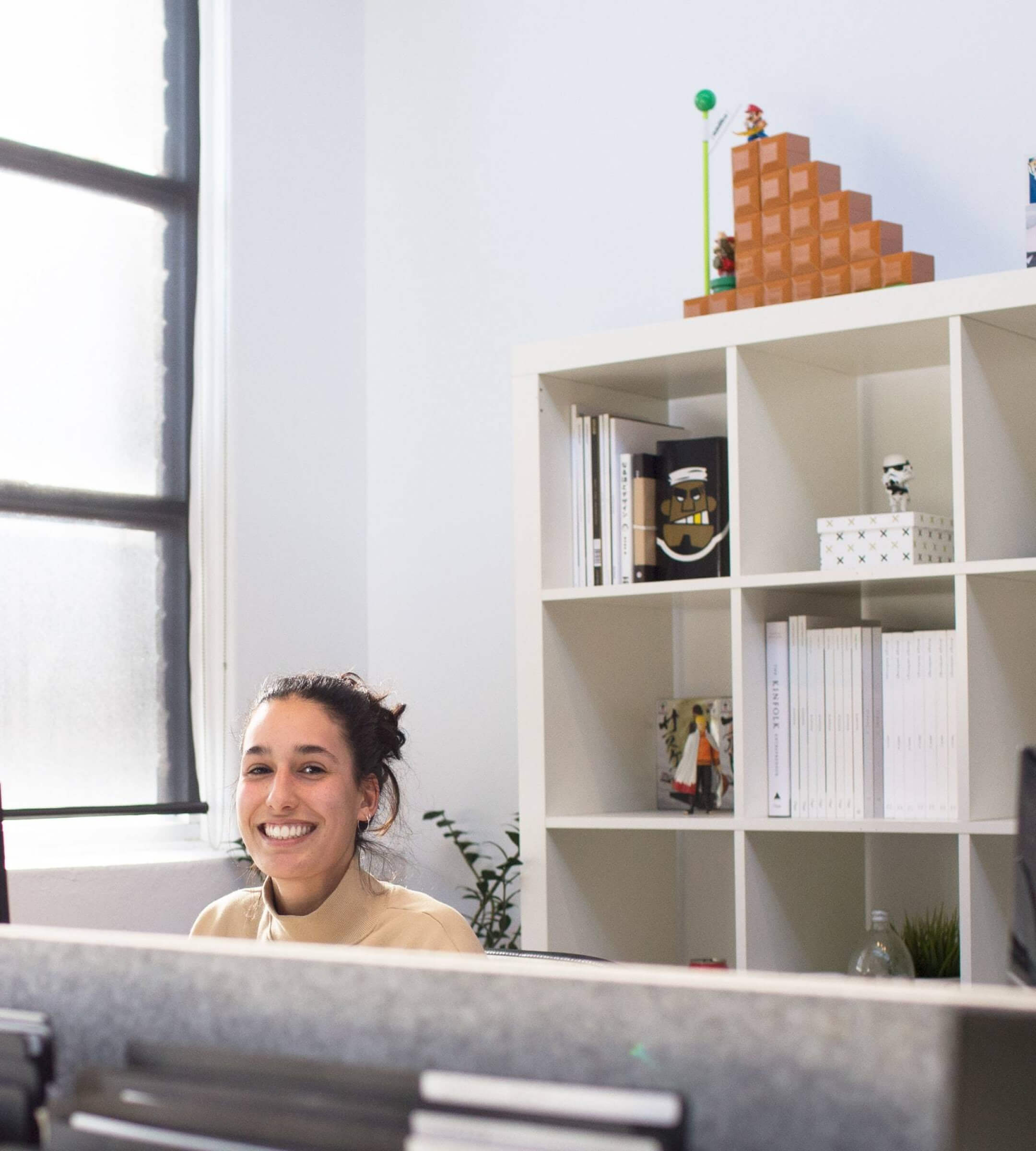
<template> <div class="min-h-screen flex flex-col md:grid md:grid-cols-2 bg-white px-4 py-16 md:py-0 md:px-0"> <div class="flex flex-col justify-center md:px-8 md:pl-20 md:pr-16"> <div class="flex flex-col md:pl-8"> <h1 class="text-gray-900 text-display-md md:text-display-xl leading-tight font-semibold"> Page not found </h1> <p class="mt-4 md:mt-6 text-gray-600 text-lg md:text-xl"> Sorry, the page you are looking for doesn't exist or has been moved. Here are some helpful links: </p> <div class="flex flex-1 w-full md:hidden flex-col-reverse gap-3 mt-8 md:mt-12"> <VBtn size="md" prefix-icon="ri:arrow-left-line">Go back</VBtn> <VBtn size="md" color="primary">Take me home</VBtn> </div> <div class="hidden md:flex flex-row gap-3 mt-12"> <VBtn size="lg" prefix-icon="ri:arrow-left-line">Go back</VBtn> <VBtn size="lg" color="primary">Take me home</VBtn> </div> </div> </div> <div class="flex relative mt-16 md:mt-0"> <img src="~/assets/images/split-image-1.jpg" alt="" class="hidden md:block w-full h-full"> <img src="~/assets/images/split-image-1-mobile.jpg" alt="" class="md:hidden"> </div> </div></template>Split Image 02
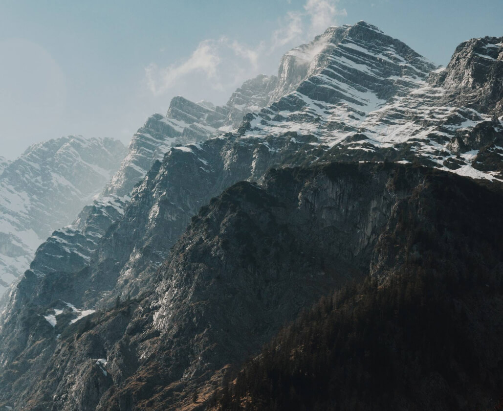
Uh oh, we can’t find that page...
Sorry, the page you are looking for doesn't exist or has been moved. Try searching our site:


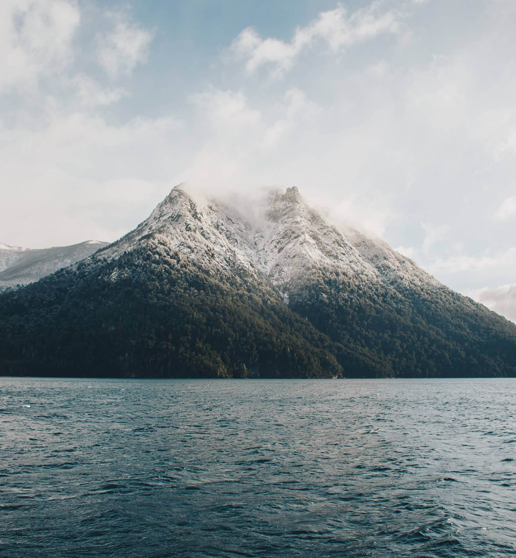
<template> <div class="min-h-screen flex flex-col md:grid md:grid-cols-2 bg-white px-4 py-16 md:py-0 md:px-0"> <div class="flex flex-col justify-center md:pl-20 md:pr-16"> <div class="flex flex-col md:pl-8"> <h1 class="text-gray-900 text-display-md md:text-display-xl leading-tight font-semibold"> Uh oh, we can’t find that page... </h1> <p class="mt-4 md:mt-6 text-gray-600 text-lg md:text-xl"> Sorry, the page you are looking for doesn't exist or has been moved. Try searching our site: </p> <div class="flex flex-1 w-full md:hidden flex-col gap-4 mt-8 md:mt-12"> <VInput placeholder="Search our site" prependIcon="ri:search-line" prependIconSize="20" prependIconClass="-mr-1" /> <VBtn size="md" color="primary">Search</VBtn> </div> <div class="hidden md:flex flex-row gap-3 mt-12"> <VInput placeholder="Search our site" prependIcon="ri:search-line" prependIconSize="20" prependIconClass="-mr-1" /> <VBtn size="md" color="primary">Search</VBtn> </div> </div> </div> <div class="flex relative mt-16 md:mt-0"> <img src="~/assets/images/split-image-2.jpg" alt="Split image 2" class="hidden md:block w-full h-full"> <img src="~/assets/images/split-image-2-mobile.jpg" alt=" Split image 2" class="md:hidden w-full h-full"> </div> </div></template>Split Image 03
404 error
Page not found
Sorry, the page you are looking for doesn't exist. Here are some helpful links:
<template> <div class="min-h-screen flex flex-col-reverse justify-end md:grid md:grid-cols-2 bg-white px-4 py-16 md:px-20 md:pt-16 md:pb-24"> <div class="flex flex-col justify-center md:px-8"> <div class="flex flex-col md:pr-8"> <p class="text-primary-700 font-semibold mb-3">404 error</p> <h1 class="text-gray-900 text-display-md md:text-display-xl leading-tight font-semibold"> Page not found </h1> <p class="mt-4 md:mt-6 text-gray-600 text-lg md:text-xl whitespace-pre-wrap">Sorry, the page you are looking for doesn't exist.{{ '\n' }}Here are some helpful links:</p> <div class="flex flex-1 w-full md:hidden flex-col-reverse gap-4 mt-8 md:mt-12"> <VBtn size="md" prefix-icon="ri:arrow-left-line">Go back</VBtn> <VBtn size="md" color="primary">Take me home</VBtn> </div> <div class="hidden md:flex flex-row gap-3 mt-12"> <VBtn size="lg" prefix-icon="ri:arrow-left-line">Go back</VBtn> <VBtn size="lg" color="primary">Take me home</VBtn> </div> </div> </div> <div class="flex relative mt-16 md:mt-0"> <img src="~/assets/images/split-image-3.jpg" alt="Split image 3" class="hidden md:block w-full h-full pr-8"> <img src="~/assets/images/split-image-3-mobile.jpg" alt=" Split image 3" class="md:hidden w-full h-full"> </div> </div></template>Split Image 04
404 error
We lost this page
Sorry, the page you are looking for doesn't exist.
Dive in to learn all about our product.
Read the latest posts on our blog.
Our friendly team is here to help.
<template> <div class="min-h-screen flex flex-col justify-end md:grid md:grid-cols-2 bg-white px-4 py-16 md:px-20 md:pt-16 md:pb-24"> <div class="flex flex-col justify-center md:p-8"> <div class="flex flex-col md:pr-8"> <p class="text-primary-700 font-semibold mb-3">404 error</p> <h1 class="text-gray-900 text-display-md md:text-display-xl leading-tight font-semibold"> We lost this page </h1> <p class="mt-4 md:mt-6 text-gray-600 text-lg md:text-xl"> Sorry, the page you are looking for doesn't exist. </p> <div class="flex flex-1 w-full md:hidden flex-col gap-4 mt-8 md:mt-12"> <VInput placeholder="Search our site" prependIcon="ri:search-line" prependIconSize="20" prependIconClass="-mr-1" /> <VBtn size="md" color="primary">Search</VBtn> </div> <div class="hidden md:flex flex-row gap-3 mt-12"> <VInput placeholder="Search our site" prependIcon="ri:search-line" prependIconSize="20" prependIconClass="-mr-1" /> <VBtn size="md" color="primary">Search</VBtn> </div> <div class="mt-8 md:mt-12"> <div> <VBtn color="primary" suffixIcon="ri:arrow-right-line" suffixIconSize="20" size="sm" flush text noRing > <p class="text-base">Documentation</p> </VBtn> <p class="text-gray-600 mt-1">Dive in to learn all about our product.</p> </div> <div class="mt-6"> <VBtn color="primary" suffixIcon="ri:arrow-right-line" suffixIconSize="20" size="sm" flush text noRing > <p class="text-base">Our Blog</p> </VBtn> <p class="text-gray-600 mt-1">Read the latest posts on our blog.</p> </div> <div class="mt-6"> <VBtn color="primary" suffixIcon="ri:arrow-right-line" suffixIconSize="20" size="sm" flush text noRing > <p class="text-base">Chat to support</p> </VBtn> <p class="text-gray-600 mt-1">Our friendly team is here to help.</p> </div> </div> </div> </div> <div class="flex relative mt-16 md:mt-0"> <img src="~/assets/images/split-image-4.jpg" alt="Split image 4" class="hidden md:block w-full h-full pr-8"> <img src="~/assets/images/split-image-4-mobile.jpg" alt=" Split image 4" class="md:hidden w-full h-full"> </div> </div></template>Illustration 01
404 error
Page not found
Sorry, the page you are looking for doesn't exist. Here are some helpful links:
<template> <div class="min-h-screen flex flex-col-reverse justify-end md:grid md:grid-cols-2 bg-white px-4 py-16 md:px-16 md:py-24"> <div class="flex flex-col justify-center md:pl-8 md:pr-16"> <div class="flex flex-col md:pr-16"> <p class="text-primary-700 font-semibold mb-3">404 error</p> <h1 class="text-gray-900 text-display-md md:text-display-xl leading-tight font-semibold"> Page not found </h1> <p class="mt-4 md:mt-6 text-gray-600 text-lg md:text-xl whitespace-pre-wrap">Sorry, the page you are looking for doesn't exist.{{ '\n' }}Here are some helpful links:</p> <div class="flex flex-1 w-full md:hidden flex-col-reverse gap-3 mt-8 md:mt-12"> <VBtn size="md" prefix-icon="ri:arrow-left-line">Go back</VBtn> <VBtn size="md" color="primary">Take me home</VBtn> </div> <div class="hidden md:flex flex-row gap-3 mt-12"> <VBtn size="lg" prefix-icon="ri:arrow-left-line">Go back</VBtn> <VBtn size="lg" color="primary">Take me home</VBtn> </div> </div> </div> <div class="relative flex mb-8 md:mb-0"> <img src="~/assets/images/illustration-1.png" alt="" class="hidden md:block w-4/5 h-auto m-auto"> <img src="~/assets/images/illustration-1.png" alt="" width="152" class="md:hidden"> </div> </div></template>Illustration 02
404 error
Page not found...
Sorry, the page you are looking for doesn't exist or has been moved. Try searching our site:
<template> <div class="min-h-screen flex flex-col-reverse justify-end md:grid md:grid-cols-2 bg-white px-4 py-16 md:px-20 md:py-24"> <div class="flex flex-col justify-center md:pl-8 md:pr-16"> <div class="flex flex-col"> <p class="text-primary-700 font-semibold mb-3">404 error</p> <h1 class="text-gray-900 text-display-md md:text-display-xl leading-tight font-semibold"> Page not found... </h1> <p class="mt-4 md:mt-6 text-gray-600 text-lg md:text-xl"> Sorry, the page you are looking for doesn't exist or has been moved. Try searching our site: </p> <div class="flex flex-1 w-full md:hidden flex-col gap-4 mt-8 md:mt-12"> <VInput placeholder="Search our site" prependIcon="ri:search-line" prependIconSize="20" prependIconClass="-mr-1" /> <VBtn size="md" color="primary">Search</VBtn> </div> <div class="hidden md:flex flex-row gap-3 mt-12"> <VInput placeholder="Search our site" prependIcon="ri:search-line" prependIconSize="20" prependIconClass="-mr-1" /> <VBtn size="md" color="primary">Search</VBtn> </div> </div> </div> <div class="relative flex mb-8 md:mb-0"> <img src="~/assets/images/illustration-2.png" alt="" class="hidden md:block w-4/5 h-auto m-auto"> <img src="~/assets/images/illustration-2.png" alt="" width="152" class="md:hidden"> </div> </div></template>Illustration 03
404 error
Under maintenance
The page you’re looking for is currently under maintenance and will be back soon. Stay tuned!
<template> <div class="min-h-screen flex flex-col md:grid md:grid-cols-2 bg-white px-4 py-16 md:px-20 md:py-14"> <div class="flex flex-col justify-center md:px-8"> <div class="flex flex-col md:pr-8"> <p class="text-primary-700 font-semibold mb-3 text-center md:text-left">404 error</p> <h1 class="text-gray-900 text-display-md md:text-display-xl leading-tight font-semibold text-center md:text-left"> Under maintenance </h1> <p class="mt-4 md:mt-6 text-gray-600 text-lg md:text-xl text-center md:text-left"> The page you’re looking for is currently under maintenance and will be back soon. Stay tuned! </p> <div class="flex flex-1 w-full md:hidden flex-col-reverse gap-3 mt-8 md:mt-12"> <VBtn size="md" prefix-icon="ri:arrow-left-line">Go back</VBtn> <VBtn size="md" color="primary">Take me home</VBtn> </div> <div class="hidden md:flex flex-row gap-3 mt-12"> <VBtn size="lg" prefix-icon="ri:arrow-left-line">Go back</VBtn> <VBtn size="lg" color="primary">Take me home</VBtn> </div> </div> </div> <div class="relative flex mt-16 md:mt-0"> <img src="~/assets/images/illustration-3.png" alt="" class="hidden md:block absolute inset-y-0 my-auto -right-20"> <img src="~/assets/images/illustration-3-mobile.png" alt="" class="md:hidden h-full w-full"> </div> </div></template>Illustration 04
404 error
Under maintenance
Sorry, the page you are looking for doesn't exist or has been moved. Try searching our site:
<template> <div class="min-h-screen flex flex-col-reverse justify-end md:grid md:grid-cols-2 bg-white px-4 py-16 md:px-20 md:py-24"> <div class="flex flex-col justify-center md:px-8"> <div class="flex flex-col md:pr-8"> <p class="text-primary-700 font-semibold mb-3">404 error</p> <h1 class="text-gray-900 text-display-md md:text-display-xl leading-tight font-semibold"> Under maintenance </h1> <p class="mt-4 md:mt-6 text-gray-600 text-lg md:text-xl"> Sorry, the page you are looking for doesn't exist or has been moved. Try searching our site: </p> <div class="flex flex-1 w-full md:hidden flex-col gap-4 mt-8 md:mt-12"> <VInput placeholder="Search our site" prependIcon="ri:search-line" prependIconSize="20" prependIconClass="-mr-1" /> <VBtn size="md" color="primary">Search</VBtn> </div> <div class="hidden md:flex flex-row gap-3 mt-12"> <VInput placeholder="Search our site" prependIcon="ri:search-line" prependIconSize="20" prependIconClass="-mr-1" /> <VBtn size="md" color="primary">Search</VBtn> </div> </div> </div> <div class="relative flex mb-8 md:mb-0"> <img src="~/assets/images/illustration-4.png" alt="" class="hidden md:block w-5/6 h-auto m-auto"> <img src="~/assets/images/illustration-4.png" alt="" width="280" class="md:hidden h-full"> </div> </div></template>